So far I've shown you some major flaws in the Globe map. From the disorganized time zones to the wonky dateline to the disproportionate landmasses and the flight paths that make no sense... It should be clear that there is some trickery going on, and that the Globe map is really just an invention. Because if the world was truly a sphere like they tell us it is, none of the things I've shown you would be an issue. We would have perfect time zones in the north and south, we would have a perfectly straight international date line, and we would also have recorded north to south circumnavigation travel and shipping routes.
Instead we have none of those things. But there is an even bigger anomaly that should be looked at. An anomaly so big that we should feel foolish for having missed it in the first place. That anomaly is Antarctica itself. For some reason, Antarctica is constantly scaled different on every different version of a Globe map. It's like none of the map makers could agree to the size and shape of Antarctica, so they all just randomly decided to scale Antarctica to the best of their ability. This results in epic differences in sizes. Just have a look at some of these maps.
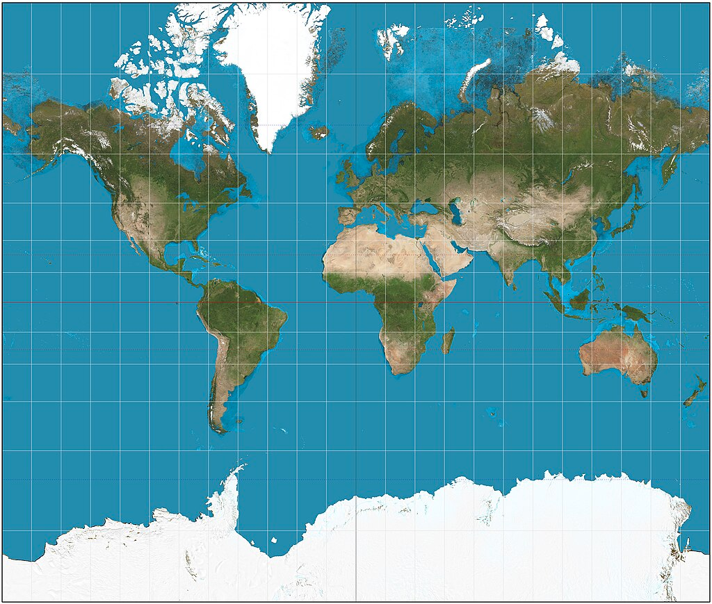
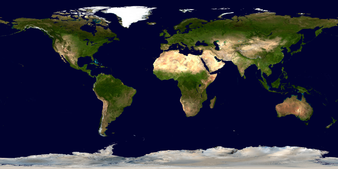
This map is taken directly from wikipedia. I want you to make a note of something because it's very important and will expose this anomaly. I want to to take note of the size of Australia, and compare it to the size of Antarctica. How many times would you say, Australia could fit into Antarctica? By this maps scale, just by eyeballing it, I would say Australia would fit into Antarctica at least 15 times.
I also want you to take a note of just how massive Antarctica appears on this map. Is it really a landmass that spans the entire distance between South America, Africa, and Australia? Seems awfully big for a globe doesn't it? Here's another Globe map, also taken from wikipedia...
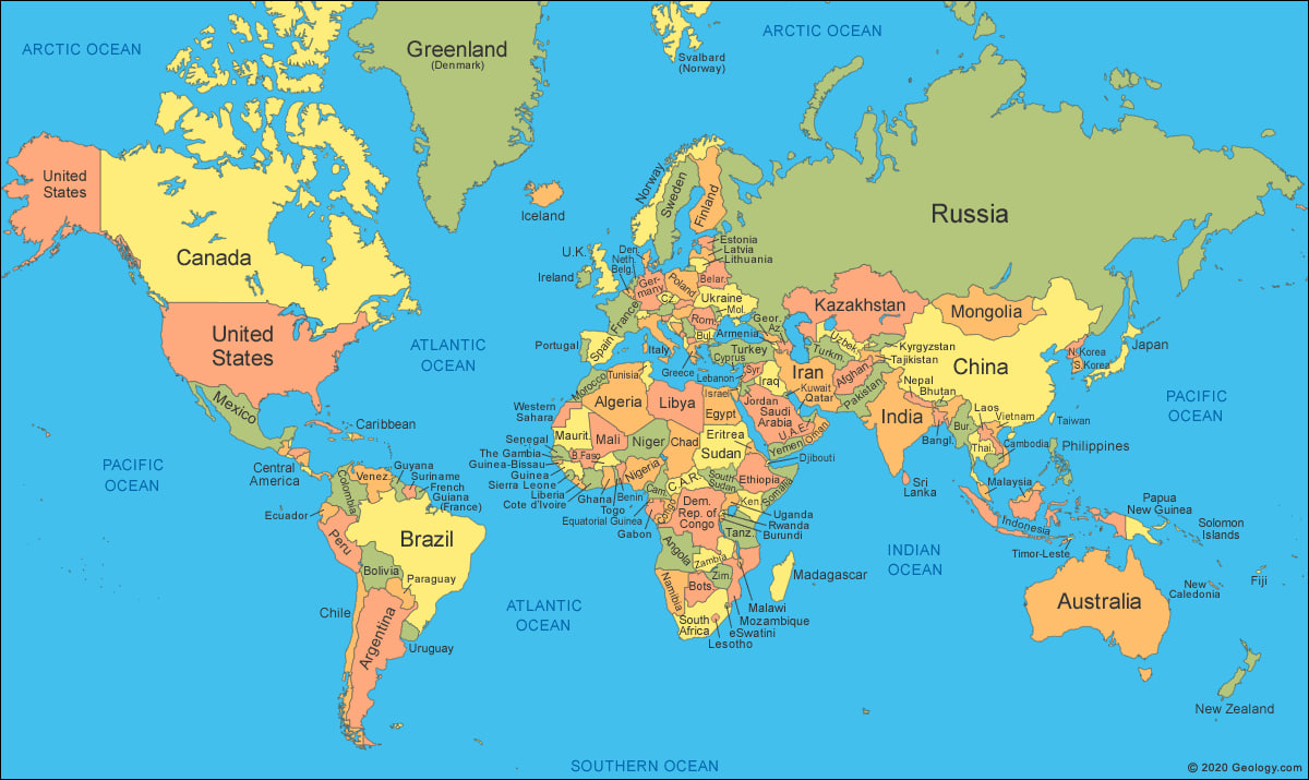
Now that's different yet again. Antarctica is far thinner, and Australia can now only fit into it about 9 times. Based on scale, all the other landmasses remain relatively unchanged. South America looks the same size as the first map, as well as the rest of the continents. The only one that really changed it's size is Antarctica. Here's another map...
Uh-oh... It looks like they just called Antarctica the southern ocean and forget to include it at all. What is this, lazy map making? Why make a map of the entire world, and but forget Antarctica? How about this map...
So Antarctica is now this tiny landmass that doesn't even stretch from South America all the way over to Australia anymore. Australia only fits into this version of Antarctica about 1 time. Yet all the other continents appear to be roughly the same size. Same pattern. Everything else stays the same except Antarctica.
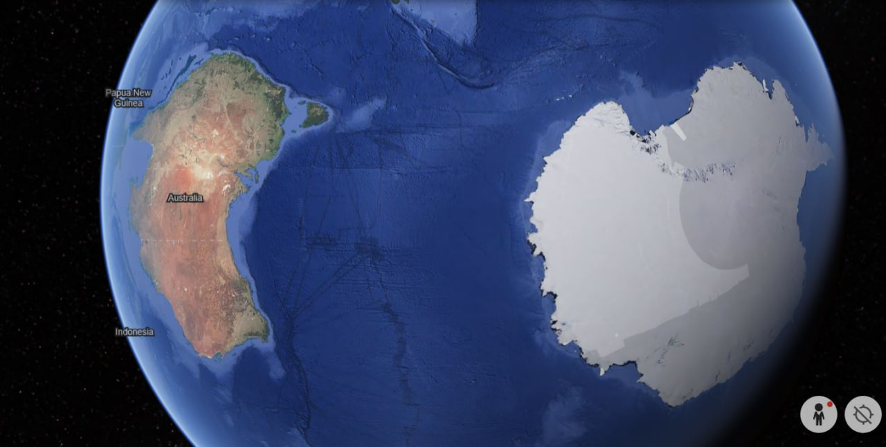
Alright, so enough of Globe maps, why don't we have a look at the actual Globe on Google Earth...
So now we have Australia fitting into Antarctica about 1.5 times on Google Earth.... The sizing of Antarctica is the anomaly. They just don't seem to be able to fit it to scale on any globe version of the map. There is one map however, in which Antarctica does scale. One map that makes everything make sense. The azimuthal equidistant projection map when viewed from the north...
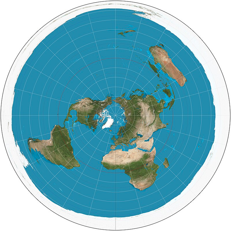
Now it's starting to make more sense. It's the same map that UN and many other " Global" organizations are using as their logos. It's the same map Hitler used for war, and it is the same map all east-west shipping and travel routes use to navigate. But where's Antarctica on this map? Yes, it's the giant white circle surrounding the world's landmasses. Australia could easily fit into it 15 times, if not more and the scale of Antarctica stretching across from South America to Australia now totally makes more sense. Of course wikipedia had to include a southern view of the Azimuthal equidistant map, which is used by precisely no one, because once again Antarctica looks completely out of place....
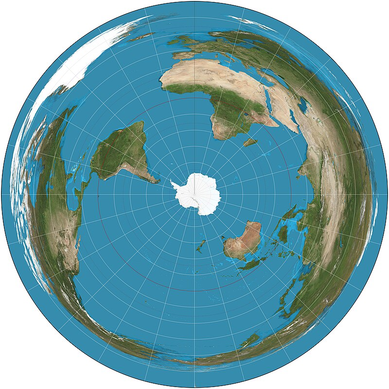
This version of the map has no basis in reality and you would never be able to use it as a source of navigation because it's completely out to lunch as to what our world really looks like. This is once again because Antarctica is not a tiny island at the bottom of our world It is in fact surrounding our world, and all of our systems of transport and navigation agree with this fact. So the map above is purely for those who believe in a Globe, and they had to create it to make people believe that this is what our world looks like from the south. Not to mention the landmasses are no longer at all to scale like they are with the north facing map. Greenland alone becomes twice the size of South America... it's a joke.
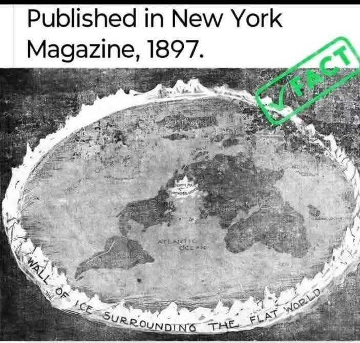
It wasn't long ago, that history believed in a Flat Earth, and here's a magazine from 1897 to prove it.
But that's not all, when it comes to maps. It gets weirder yet. There is another map, that should be considered the greatest discovery of our time. A map that has been hidden in plain sight this whole time. A map that shows us our world is vastly different than we've been told.