
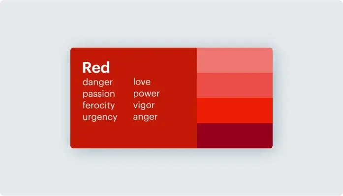
Red is one of the most powerful colors in design and marketing. It grabs attention instantly, evokes strong emotions, and is deeply rooted in cultural symbolism. Whether used in branding, UX design, or fashion, red can convey passion, urgency, and even luxury.
Psychology of the Color Red
Red is known as an “action” color. Studies show it can increase heart rate, create excitement, and even stimulate appetite. This is why many brands use red in marketing—think of Coca-Cola, Target, and McDonald’s.
Bright reds energize and promote urgency (e.g., sale banners, call-to-action buttons).
Deeper shades like burgundy evoke sophistication and elegance, often used in luxury branding.
While red can encourage movement and bold decisions, it also has an intense side. Too much red can overwhelm, trigger aggression, or create stress, making balance crucial in design.
Red in Marketing and Branding
The color red in marketing is used to create excitement, urgency, and trust. Major brands strategically incorporate red in their logos and campaigns:
Fast food brands (McDonald’s, KFC) use red to stimulate hunger.
Retail stores (Target, H&M) leverage red to encourage quick purchases.
Luxury brands (Ferrari, Christian Louboutin) use deep reds for exclusivity and boldness.
In web design, red is often used in CTA buttons like “Buy Now” or “Limited Offer,” as it naturally draws the eye.
However, overusing red can have the opposite effect, making a design feel aggressive rather than inviting.
Cultural Significance of Red
Red’s meaning varies across cultures:
In China and India, red symbolizes luck, prosperity, and celebration.
In Western culture, it represents love, passion, and power.
In some African countries, red is linked to mourning and loss.
In Japan, red is associated with life, vitality, and protection.
These cultural perspectives influence how red is used in branding and design across different markets.
Using Red Effectively in Design
When incorporating red into design, consider:
✔ Industry fit – Best for food, fashion, sports, and sales-driven businesses.
✔ Shade selection – Bright red for urgency, deep red for luxury, muted red for warmth.
✔ Pairing wisely – Red with white feels modern, red with gold is luxurious, and red with black is bold.
Final Thoughts
The psychology of the color red makes it one of the most versatile and impactful colors in branding and design. Whether you’re looking to attract attention, inspire action, or create an emotional connection, red can help your message stand out—when used thoughtfully.
Would you use red in your next design project? Let’s discuss in the comments! 🚀