When I first started working on events in New York City, one of the most important things I learned was how crucial a good repeat banner backdrop is. Whether it's for a red carpet event, a product launch, or a press conference, the backdrop plays a major role in how everything looks in photos and videos.
Designing one that looks professional yet fits the vibe of the event can be tricky, but I’ve picked up some tips along the way that can help make the process smoother.
Here are some of the do's and don'ts I've learned when it comes to designing repeat banner backdrops, especially for an event-heavy city like NYC.
Do: Know the Purpose of Your Backdrop
The first step in designing any repeat banner backdrop is to be clear about its purpose. Is this for a formal corporate event? A fun product launch? A casual meet-and-greet? The purpose of the event should shape the overall design, including the colors, logos, and layout.
For example, when designing a backdrop for a tech company’s event, I went for a minimalist design with clean lines and neutral colors. The goal was to keep the focus on the speakers, not the background. On the other hand, for a fashion event, I opted for something bold and flashy because I knew the goal was to create eye-catching photos.
Always tailor your backdrop to the event’s theme and atmosphere.
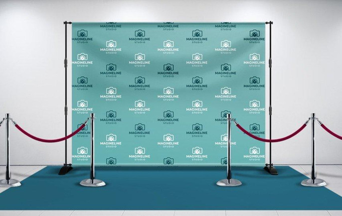
Don’t: Overcrowd the Design
One of the most common mistakes I see people make is trying to fit too much on the backdrop. A repeat banner backdrop is meant to showcase a logo or a few key graphics repeatedly in a subtle, visually appealing way. Overloading it with too many logos, text, or colors can make it look cluttered and unprofessional.
Stick to one or two logos or design elements that repeat consistently. If the logos are too big or there are too many, the backdrop can look overwhelming and distracting in photos. Keep it simple so that the backdrop enhances the event without stealing the spotlight.
Do: Choose the Right Colors
Color choice is another critical factor in designing a good backdrop. The colors should not only match your brand but also look good in photos. In NYC, where many events take place in well-lit venues or outdoors, it’s important to think about how your colors will appear in various lighting conditions.
I've found that neutral backgrounds, like white, grey, or black, often work best because they let logos stand out. Bright colors can work, too, but you have to be careful that they don’t clash with other elements at the event, like the lighting or decor.
Also, make sure the colors of your logo stand out against the background. For example, if your logo is white, don’t use a white backdrop, or it will disappear. A contrasting background ensures that your logo remains the focal point.
Don’t: Use Low-Quality Graphics
This might seem obvious, but it’s crucial to use high-quality logos and images for your repeat banner backdrop. I once made the mistake of using a low-resolution logo, thinking it wouldn’t be noticeable. But when the backdrop was printed, it looked pixelated and unprofessional.
For any large format printing, including banners, make sure the files are high resolution—preferably vector files (like .ai or .eps formats). Vector graphics ensure that your logo will look crisp and clean, no matter how big the backdrop is. If you’re working with a designer, ask them to provide these files, or work with a printing company that can help you convert lower-quality images into high-res versions.
Do: Keep the Layout Balanced
One thing that’s easy to overlook is the spacing between logos. The last thing you want is for your logos to be too close together or unevenly spaced. It creates a jumbled look that can be distracting in photos. I recommend using a grid layout to ensure even spacing and alignment.
Also, consider how the logos will appear when people stand in front of the backdrop. Make sure the key parts of your design are visible at various heights, so the logos aren’t cut off when someone is standing too close or too far away. I usually test this by placing some logos at different heights and taking test shots to see how they appear.
Don’t: Ignore the Scale
The scale of your backdrop and its elements matters just as much as the design. A common mistake is creating a backdrop that’s either too small or too large for the event space. If it’s too small, it won’t have the impact you want, and if it’s too large, it could dominate the space in a way that looks awkward.
When I’m designing a repeat banner backdrop for an NYC event, I always measure the space where the backdrop will go. This helps me make sure the size of the banner and the scale of the logos are appropriate. You want the backdrop to fill the space without overwhelming it. If you're unsure, it's always a good idea to consult with the company handling the printing and setup, like Backdrop Banners NYC(www.backdropbanners.nyc), for advice on sizing.
Do: Plan for Setup and Storage
One thing I didn’t think about early on was how the backdrop would be set up and stored after the event. Some backdrops are designed to be used only once, while others are more durable and can be reused for multiple events. If you plan to reuse the backdrop, it’s worth investing in one that’s printed on a durable, high-quality material.
Additionally, think about the setup process. Some banners come with frames that make it easy to assemble and take down, while others might require more effort. If you don’t have a dedicated setup team, go for something simple and portable.
Don’t: Forget About Lighting
The lighting at the event will have a big impact on how your backdrop looks in photos. Poor lighting can make even the best-designed backdrops look dull or washed out. I always work closely with the event team to make sure there’s proper lighting focused on the backdrop.
If possible, use soft lighting to avoid harsh shadows and ensure that your logos are clearly visible. You don’t want the lighting to overpower the backdrop, but you do want it to highlight the key elements of the design.
Final Thoughts
Designing a repeat banner backdrop in NYC can be a rewarding process if you take the time to consider all the details. By focusing on things like purpose, simplicity, color choice, and scale, you can create a backdrop that not only looks great but also enhances the event and provides a professional look in photos.
When working with a professional printing company, you can also get valuable input on the materials and design aspects that will work best for your specific event. By following these tips, you’ll be well on your way to creating a backdrop that makes a lasting impression.