
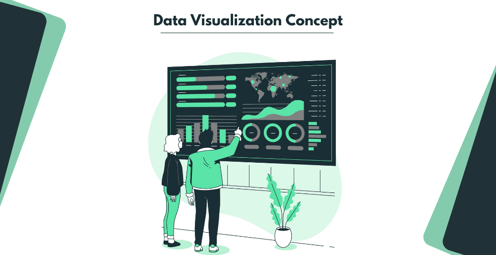
There has been an enormous growth in data generation and consumption by business organizations these days. Sometimes, data sets are so large that it becomes impossible to use them. Thus, it led to the growing need for making data digestible, understandable, and organized. That’s where data visualization’s help comes. Data visualization tools help to create dashboards for keeping track of every single detail of your business. These tools build graphics in pie charts, bar charts, diagrams, timelines, matrix charts, word clouds, etc. The main motive of these visualization tools is to provide simplicity in the presentation of the business data.
Designers can’t directly put data sets with thousand entries and create a visual presentation all at once. No one wants to spend hundreds of hours manipulating and plotting data on the charts. That’s where we need the help of the data visualization tools.
Further in this blog, we will discuss the top data visualization tools you can use to create visuals for your audience.
BUT FIRST LET’S UNDERSTAND THE BASICS OF DATA VISUALIZATION
In simpler terms, data visualization is the visual representation of information. It is the use of images and graphics for presenting complete information logically. The tools for data visualization are suitable for creating visuals rather than performing sophisticated data analytics. It utilizes all the data from any specific source and creates them into a visual representation. Many versatile tools are easy to use and will serve different styles and purposes for data representation.
HOW DO YOU CHOOSE THE RIGHT DATA VISUALIZATION TOOLS?
Here are some important factors that will help you in choosing the right data visualization tools solution –
- Different data visualization application tools offer different ways to collect and view data. You must know your business requirements and look for tools that can be easily connected to.
- You must know what platform the data visualization software runs on and what devices it supports. Some of the solutions are cloud-based, and others are based on desktop and mobile devices. Some applications only work on Windows and might create problems if you are using a Mac.
- Many data visualization applications might face difficulties because of the extremely large files. So, if the rendering engine does not support the required speed of the web pages and real-time dashboards, you might face problems. You should always check whether the tool you are using supports your organization’s performance or not.
- Flexibility and scalability are two crucial factors while choosing the right tool. Your business might require to change the templates, inputs, data, or any other criteria from time to time. So, it is important to make sure that the data visualization program you choose supports all these changes and updates.
- Review your choices carefully to choose the right package cost of the visualization tools. You will find several solutions that are free of cost and might not deliver comprehensive features.
- Lastly, you must be sure that the platform you are using for visual representation provides adequate protections for accessing, securing, and sharing data.
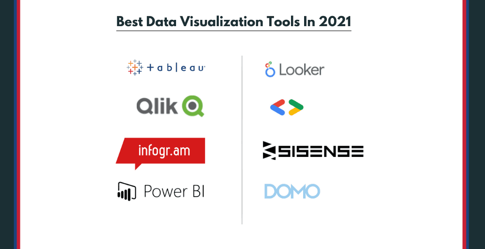
LIST OF THE BEST DATA VISUALIZATION TOOLS IN 2021
1. TABLEAU
Tableau is the most common data visualization tool that gathers data from various areas like machine learning, artificial intelligence, and business intelligence. This tool is widely used by data analysts, scientists, statisticians, etc. It helps in better visualization of data and getting a clear opinion based on data analysis. A tableau is a prominent tool that takes the data and produces visualization output very quickly. You don’t have to worry about your data while using Tableau, as it guarantees to provide the highest level of security.
This tool is available for individual data analysts and large business organizations as well. Tableau is a paid data visualization tool with a 14-day free trial option in the starting. Altogether, this is a powerful analytic and visualization tool capable of producing different graphs and charts. Thus, it makes it easier for businesses to communicate insights and respond to stakeholders’ questions.
2. LOOKER
Looker is a new generation data visualization tool that analyses the data in-depth for obtaining useful insights and is a part of Google Cloud. Based on the data visualization and in-depth analysis with the help of a Looker, businesses can make instant decisions. This tool is extremely useful as it provides clear and colorful templates for your data presentation. Organize your data using maps, funnels, timelines, combined charts, or create your visualizations through Looker. You can build a data exploration platform while using Looker for accessing data easily for the whole company. In Looker, one can set the dashboard for multiple users, including customers, staff, partners, or management teams. You can share Looker data visualizations with anyone using any particular tool as well.
3. MICROSOFT POWER BI
This data visualization platform allows the users to pull information from multiple data sources and place it into interactive dashboards. It’s a popular tool with data visualization capabilities, impressive usability and is compatible with other Microsoft Office products. Power BI tool offers self-service analytics options for analyzing, aggregating, and sharing data logically. It has built-in artificial intelligence capabilities and excels in integration facilities along with hundreds of data visualization options. Microsoft Power BI also offers support systems such as FAQs, forums, and live chat support.
This tool is the epitome for businesses as it helps create real-time reports for the most critical KPIs and metrics. It is simpler to merge everything into one comprehensive report with the help of the Power BI data visualization tool. Also, Power BI is useful for data fetching in SEO. Microsoft Power BI comes in two pricing options. The first plan is free with a storage limit of 1 GB. The second package for Power BI costs $9.99 per user per month with a 10GB storage limit.
4. SISENSE
Sisense is an intelligence-based data visualization system providing various tools for data analysts. You can use Sisense for simplifying complex data easily for getting insights for your organization. It is properly designed based on knowledge graph technology for offering artificial intelligence throughout. Thus, Sisense allows you to get the relevant insights and deeper investigation of the data. Sisense is a highly customizable tool that includes data connectors such as Snowflake, Salesforce, Adobe Analytics, Amazon S3, Dropbox, and several Microsoft applications. It is also famous for offering full-time customer support services. Sisence is a highly efficient tool that you can install easily for allowing raw data to visualize results instantly. The pricing of this tool is not disclosed.
5. QLIK SENSE
Qlik Sense is another data visualization tool helping companies to become data-driven enterprises. It provides an associative data analytics engine, sophisticated AI system, and scalable multi-cloud architecture. Moreover, on the Qlik Sense tool, one can easily combine, visualize and explore data of any size. According to your current data, you can instantly update it into interactive charts, tables, and other visualizations. There is a free service option for Qlik Sense for 30 days, and then you have to buy the paid version for advance options. This powerful tool also provides a full range of analytics services, from data exploration to conversational analytics along with data visualization.
6. DOMO
Domo is the one-stop solution for an open-source tool for data visualization and analytics. You can connect Domo to any database to bring all your information together into one cohesive view. You will find various visualization tools for customizing your data reports by adjusting their colors, images, texts, etc. Moreover, there is a pre-built dashboard in the Domo tool that helps obtain quick insights from the data. The tool also gives the drag & drop integration and transformation feature for real-time data visualization. Domo tool has a Magic ETL feature that helps in preparing your data automatically with suggested visualizations. There are three versions of the Domo tool – the starter, professional, and enterprise. The cost-free version is the starter version, and the other versions start at $83 per user per month.
7. INFOGRAM
This dedicated visualization tool helps create charts, dashboards, and presentations for businesses. It has a drag-and-drop interface that quickly analyses documents into a graphical presentation. This web-based tool supports more than 35 types of interactive data visualization formats. Moreover, it is an easy tool that shares and produces consistent work with customizable branded templates. Infogram can also be used for making graphic images for SEO. There are several pricing tiers for the Infogram tools –
- Basic version – Free of cost
- Pro version – $19 per month
- Business version – $67 per month
- Team version – $149 per month
- Enterprise version – You have to contact the vendor for information on this.
8. GOOGLE CHARTS
The last tool on our list is the Google Charts that works well with dynamic data. This powerful data visualization tool is free of cost and helps to create interactive charts and dashboards. For business companies looking for small-budget data visualization tools, Google Chart is the right solution. Moreover, if you want your audience to interact with your data, Google Charts is the most feasible option. Data sources for Google Charts include Google Spreadsheets, Salesforce, Google Fusion Tables, and other SQL databases. In Google Charts, you will get various chart types like maps, scatter charts, histograms, bar charts, pie charts, treemaps, timelines, etc. Google Charts uses HTML5/SVG, and thus, it has cross-browser compatibility as well.
VISUALIZE YOUR PLAN WITH VCANA GLOBAL
Visualizing and organizing data on charts and graphics is a great way to present large chunks of your business data. Data visualizations engage the audience and thus, contribute to converting maximum leads. With the help of all the data visualization tools mentioned above, you can easily represent your data effectively.
At Vcana Global, we are aware of the importance of arranging data in organized formats. Thus, our team works skillfully for helping our clients in creating impactful visualizations of data. We are using the Microsoft Power BI tool for creating visualizations and other facilities. Get your business an interactive way to connect with your audience with Vcana Global. So, if you want engaging leads for your business, contact Vcana Global online or call us at 99154-32198.
We look forward to helping your business to grow globally.