Mobile-first has been a buzzword in game development for years now, and rightly so. With more than half the world’s internet traffic coming from mobile devices, designing games especially poker games primarily for smartphones isn’t just a smart move. It’s expected.
But here’s the thing: mobile-first doesn’t automatically mean mobile-friendly. Some poker games that are designed with smartphones in mind still flop. Players get frustrated with cramped interfaces, sluggish response times, or menus buried under unintuitive icons. And in an industry where user experience is everything, one bad hand can send your players running to a competitor.
If you’re serious about poker game development, there are some key design principles you need to understand not just to make your game function on mobile, but to make players want to come back again and again.
Let’s talk about where poker apps go wrong and how to avoid those costly missteps.
1. Cluttered UI: When Less Is More
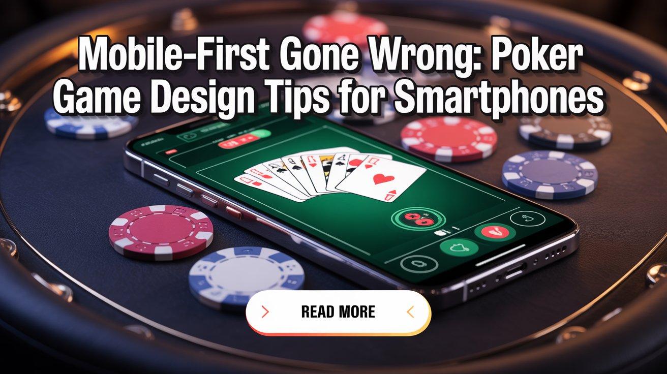
Poker is a game of focus. On a mobile screen, there’s no room for distraction. Yet many poker apps overload the player with buttons, animations, chat windows, bonus popups, and social feeds all crammed into a 6-inch display.
What often happens is that developers try to pack in features from the desktop version without considering screen real estate. What you end up with is a cluttered, overwhelming mess.
Design Tip: Prioritize the core gameplay first. The poker table, player actions, chip counts, and card visuals must be crystal clear. Keep secondary features like chat, leaderboards, and settings behind expandable menus.
2. Thumb-Friendly Controls
On mobile, players use their thumbs. That sounds obvious, but many game interfaces are still designed for clicks, not taps. Tiny fold/call/raise buttons placed too close together lead to misclicks costing players chips and patience.
Design Tip: Buttons should be large enough for a comfortable tap, spaced far enough apart to prevent accidental actions, and located within the natural thumb zone typically the bottom half of the screen. The betting slider, in particular, needs to be both responsive and precise.
3. Optimize for One-Handed Play
Many players play poker casually while commuting, waiting in line, or watching TV. That means they often play with one hand. Complex interfaces that require two-handed gestures or keyboard input quickly become frustrating.
Design Tip: Make all major gameplay interactions possible with a single hand. Don’t require players to hold the phone horizontally unless necessary. Keep menus navigable with swipes or taps instead of tiny toggle switches or dropdowns.
4. Minimal Load Times, Maximum Fluidity
In the world of mobile games, speed matters. If your poker app takes too long to load or lags between hands, players will uninstall without a second thought.
This is where technical choices during poker tournament software development can make or break you. Efficient asset loading, smart caching, and reduced server latency are essential. You don’t need fancy transitions or flashy animations if they slow the game down.
Design Tip: Prioritize performance over visual flair. Make sure every interaction dealing cards, folding a hand, opening a menu feels instant.
5. Responsive Design for Every Device
Not all phones are created equal. From budget Androids to the latest iPhones, screen sizes and resolutions vary wildly. If your app only looks good on one type of device, you’re excluding a massive chunk of your audience.
Design Tip: Use responsive design techniques to ensure that your poker interface scales gracefully across devices. Text should be legible, buttons should stay tappable, and nothing should break when switching from portrait to landscape.
This is something that an experienced poker game development company should absolutely factor in from the start not after launch.
6. Simplicity in Onboarding
Your app might have every feature under the sun, but if new players can’t figure out how to get started in the first 30 seconds, they’ll bounce. Fast.
Many poker apps make the mistake of requiring account creation, email verification, and tutorial completion before letting users even sit at a table.
Design Tip: Let people jump into a quick game with minimal setup. Use guest accounts if needed. Tutorials should be optional and bite-sized, not a 5-minute walkthrough. Guide players with simple tooltips during actual gameplay instead of forcing them to memorize everything up front.
7. Make Tournaments Accessible, Not Confusing
Tournaments are a huge draw, but they’re often buried behind confusing lobby designs and inconsistent terminology. Labels like “Freezeout” and “Rebuy” may mean something to poker veterans, but they can intimidate or confuse new players.
Here’s where good UX meets smart content strategy.
Design Tip: Offer clear tournament categories with simplified explanations. Use icons or tags to show things like entry fee, number of players, prize pool, and time remaining to register. If you’re working with a poker tournament platform provider, ensure they give you control over how tournament data is presented.
8. Design for Short Sessions, Encourage Long Play
Mobile users dip in and out of apps all day. While a tournament might last an hour or more, the typical user may only play for a few minutes at a time. That’s why your poker app needs to work well for both quick hands and longer sessions.
Design Tip: Offer fast game modes, like 3-player Sit & Gos or hyper turbo tournaments. Let users resume tournaments easily after disconnections. And be smart about player engagement: use notifications wisely to bring players back, not annoy them.
9. Visuals Should Enhance, Not Distract
Mobile screens are small. That means every design choice matters. Some poker games go overboard with flashy tables, avatar animations, or 3D effects forgetting that clarity is king.
Players need to know what cards are on the table, what actions are available, and what the pot size is at a glance.
Design Tip: Choose a visual style that is clean and consistent. Highlight important elements (like active players or current bet) using subtle animations or color shifts. Avoid decorative elements that don’t serve the game’s functionality.
10. Security and Fair Play Need Visibility
In poker, trust matters. Mobile players want to know the game is fair and secure, especially when real money is involved. But security features often live behind generic privacy policies or hidden menus.
Design Tip: Surface your security messaging without being overbearing. Let players know how shuffling is handled, how collusion is detected, or how accounts are protected. This builds credibility, especially if you’re positioning yourself as the best poker game development company in a crowded market.
11. Real-Time Chat vs. Distraction
Chat features are tricky. They can add community vibes but also clutter the screen or cause drama. Worse, chat boxes can sit right on top of core UI elements on small devices.
Design Tip: Make chat optional, and easy to hide. Consider canned chat messages or emojis for quick communication. Use moderation tools to avoid toxicity. If you allow voice chat, ensure it doesn’t interfere with gameplay audio or lag the system.
12. Test With Real Users (Not Just Devs)
Perhaps the biggest reason mobile-first poker games flop? They’re tested in ideal conditions by developers, on flagship phones, over perfect Wi-Fi. But your average user isn’t in that bubble.
Design Tip: Run beta tests with actual players on mid-range devices, slow connections, and real-world environments. Gather feedback early and often. Iterate based on frustration points, not just bug reports.
If you're looking to scale up fast or build something more advanced, it might be time to hire poker software developer talent who understands these nuances from day one.
Final Thoughts
Building a poker app for mobile sounds simple. Shrink the desktop version, slap on some tap controls, and you're good, right?
Not even close.
The difference between a poker app that thrives and one that flops is all in the details: thoughtful UI, thumb-first interaction, intuitive navigation, and the patience to test with real users.
Don’t get fooled by the idea that “mobile-first” is a checkbox. It’s a design philosophy that requires restraint, empathy, and constant iteration.
And if you're deep into poker tournament software development, working with the right poker tournament platform provider can give you a technical edge but it’s your design choices that will keep players coming back. So, keep it clear. Keep it smooth. And always think like your player, not your product manager.