
In the realm of data visualization, a crucial element in conveying complex information lies in the ability to present it intuitively. Let's dive into the nuances of good and bad data visualization examples to discern the key factors that make or break these visual representations.
Understanding the Essence: Good Data Visualization Examples
Clarity in Complexity
Navigating through intricate datasets becomes seamless when presented with clarity. Effective data visualizations distill complex information into easily digestible visuals, providing a comprehensive snapshot.
Utilizing Appropriate Visual Elements
Selecting the right chart or graph is pivotal. Bar charts for comparisons, pie charts for proportions – each visual element serves a purpose. A harmonious blend of colors aids in highlighting significant data points, ensuring the audience's focus is directed where it matters.
User-Friendly Interactivity
Engaging your audience is vital. Incorporating interactive features enhances the user experience, allowing individuals to explore the data at their own pace. This fosters a deeper understanding and connection with the information presented.
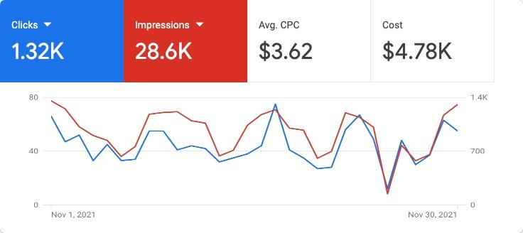
This Data Visualization Example is really helpful for businesses. The picture shows a sample page that displays information about all the advertising campaigns happening on Google Ads for a specific company.
The Pitfalls: Bad Data Visualization Examples
Misleading Graphics
One of the cardinal sins in data visualization is the use of misleading graphics. It's essential to ensure that visuals accurately represent the data, steering clear of exaggeration or distortion.
Overcomplicated Designs
Sometimes less is more. Overcrowded charts and convoluted designs hinder comprehension. Simplicity should be a guiding principle, with each visual element contributing meaningfully to the narrative.
Ignoring the Audience's Perspective
Understanding your audience is paramount. Ignoring their level of expertise or familiarity with the subject can lead to misinterpretation. Tailoring visualizations to suit the intended audience ensures effective communication.
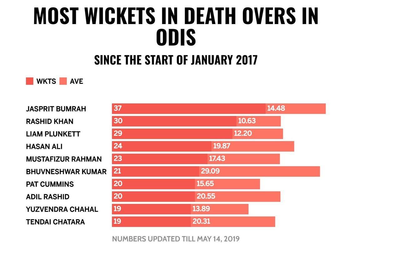
This picture shows a bad example of displaying data. The issue is with the colors used to show wickets and the average. Both things are shown in different shades of red on the same bar, making it hard to tell them apart.
Mastering the art of data visualization requires a delicate balance between creativity, accuracy, and audience understanding. By learning from both good and bad examples, we pave the way for a future where data speaks volumes through compelling visual narratives.