

Researchers have analyzed that today users are creating quintal bytes of data per day. The question here comes that does this data is useful to the business users. The answer is yes, but business users must have well knowledge how to operate and make use of the data. They must know what kind of data visualization do they use to properly digest all that data.
Data Visualization tools help business owners to drive their business and providing the opportunity to view the data using various visually appealing graphics rather than a traditional excel row and columns data. These data visualization tools provide almost all options for data representation of graphs and charts. But most users became confused as to how to choose the best chart or graph for data visualization. In this article we will see in all the details under which circumstances users choose the appropriate charts and graphs.
You may also like: Best Sales Graph and Charts for Sales Manager
How will you choose the right chart or graph for your data?
In you have a bunch of data and you finding the insight information from data the you need to make sure you use the right charts and graph for data analysis. If suppose your data are capable and working with multiple chart types then it is up to your decision to select one and make clear that your presented chart or graph is accurate and strong.
It is important to understand that data is only valuable if you know how to visualize it and present it. Below we will understand the overview for different chart types and explain how to pick the correct one in different scenario.
Basic questions you should ask before deciding on your data visualization graph
Make a planning before selecting any data visualization graph for your project or business goal.
- What story does your data tell?
You must know the reason behind choosing charts and graphs and why you need it. Charts, graphs, and infographics reveal hidden insights of your data that are helpful for finding patterns, identifying trends, and storytelling data. Create simple and effective visuals so that your audience gets a clear message from your shared view.
Comparison
Comparison charts are used to compare one or more datasets. They can compare items or show differences over time.
Relationship
Relationship charts are used to show a connection or correlation between two or more variables.
Composition
Composition charts are used to display parts of a whole and change over time.
Distribution
Distribution charts are used to show how variables are distributed over time, helping identify outliers and trends.
2. Do you want to compare values?
For comparing two more value set or data sets charts are the most effective approach to use. They can easily show low and high values of the data sets. For comparing two data sets you must use the following charts:
- Column
- Bar
- Pie
- Line
- Scatter Plot
- Bullet
3. Do you want to show the composition of something?
This type of chart used to show how individual parts make up the whole of something. This focus to show composition of your data.
To demonstrate composition, you can use the below chart:
- Pie
- Stacked Bar
- Stacked Column
- Area
- Waterfall
4. Do you want to understand the distribution of your data?
Distribution charts help you understand the range of outliers, general trends and information in your values.
Use these charts to show distribution:
- Scatter Plot
- Line
- Column
- Bar
5. Are you interested in analysing trends in your data set?
Here you need to understand how to show the trend for a specific period of time. This chart shows the trends in the market for a given period. After gaining insights from your audience, you should decide whether you want to communicate a particular trend related to a particular data set within a predetermined time period. What would work best?
It will work best in:
- Line
- Dual-Axis Line
- Column
6. Do you want to better understand the relationship between value sets?
This relationship charts used to show how one variable relates to other or numerous different variables.
It will work best in:
- Scatter Plot
- Bubble
- Line
Want a free trial: Tired of Traditional Reporting? Start Your ANALYSIS Instantly with EzInsights Today!
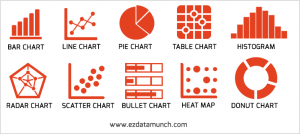
The most common used data visualization chart type
Now you have a glimpse of the original question before creating the visualization. Now discuss the types of charts popular for data charts so that your data can be viewed in the maximum possible way.
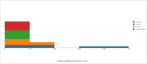
- Bar chart & Column Chart
Bar chart and column chart is a visualization chart that is used to compare one or more different objects. The bars on a column chart are vertical while the bars on a bar chart are horizontal. Both bar and column charts belong to the same group for comparison.
Bar Chart
When to use bar chart
Bar chart are used to compare data values for two or multiple years. Bar charts have a much heavier weight to them than compare to other graphs, so they really emphasize a point and stand out on the page.
Column Chart
Rules for creating bar and column charts:
Start at zero: You need to start your column chart always from zero. Suppose if you have started the column chart at some arbitrary chart it will make confusion to compare column chart with others.
Label the axes: It is best practice to label the axes and give your viewer context.
Labels on bars: This helps to preserve the clean lines of the bar lengths.
Use less colour: Try to use very less colour. You can highlight one bar in particular if that is the message you want to get across.
Line Chart
The most preferred and classic type of chart graph is the line chart. Line charts can be used to show relationships within a continuous data set, and can be applied in a variety of categories, including variations in the daily number of visitors to the site or stock prices.
Tips for creating line charts:
- Clearly label your axes - Making sure that the audience knows what they are evaluating.
- Remove distracting elements - Eliminate guidelines to reduce trend, rate of change, and distraction.
- Use solid lines only.
- Avoid comparing more than 5-7 lines - you don't want your chart to be cluttered or difficult to read. Imagine the data you need to tell your story.
Pie Chart
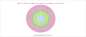
A pie chart usually represents numbers in percentages, which are used to visualize an entire relationship or a structure. The pie chart can be represented by a constant number divided into categories that constitute its individual parts.
Tips to remember before making a pie chart:
- Do not describe too many categories to ensure spacing between slices.
- Keep it clean and consistent.
- Keep it 2-D only. Avoid using 3-D imagery.
- Do not use more than 5 items in a pie chart otherwise it becomes congested.
Tables
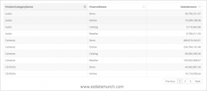
The table uses the rows and columns format to present the data. Uses of the table is to compare pairs of values or display qualitative information.
Guidelines for creating tables:
- Ask yourself how your table will be used and define your audience.
- Consider removing grid lines to increase readability.
- The numbers should be aligned to the right, as it makes it easier to compare.
Histogram
A histogram is a type of graph that shows the distribution of a dataset. It visualizes the distribution of data over a continuous interval or a fixed time period.
Guidelines for creating histogram
- Add a subtle border between bars
- Add data labels
- Set gap width to zero
Radar Chart
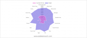
Radar charts are also known as spider charts used to show qualitative data, composite scores, or comparisons between multiple series.
Guidelines for creating Radar chart:
- Keep it simple
- Remove markers
Scatter Plot
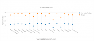
The scatter plot can also be referred to as a scattergram chart that used a relationship between two different variables. Scatter plot used when there are many data points and you want to highlight similarities in the data set.
Design Best Practices for Scatter Plots:
- Include more variables, such as different sizes, to incorporate more data.
- Clearly label each axis
- Highlight clusters of data
- Start y-axis at 0 to represent data accurately.
- If you use trend lines, only use a maximum of two to make your plot easy to understand.
Bullet Chart
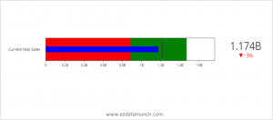
For making a bullet chat you require only two columns or rows of data from your Dataset. If you want to add key feature like range and target volume to need to specify additional column.
Benefits of using Bullet Chart:
- It can be adapted to horizontally or vertically
- It can display multiple measures
- The information is presented in an easy to digest format
Choose this type of chart or graph to create a dashboard
Are you ready to play with your favorite charts and graphs? Create a free lifetime account with EzInsights and get started with a data set with your charts and graphs.